
Artist, typographer, Welsh working-class ‘urban creative’ – Gordon House was a true behind-the-scenes champion of post-war design. His fingerprints can be found on The Beatles’ White Album and he revolutionised how the British arts establishment appeared in print with his clean, decluttered ‘House’ style.

Red Arcs, 1967, screenprint
In 1957 three new neo-grotesque typefaces hit the market: Folio, designed by Konrad Bauer and Walter Baum, Univers by Adrian Frutiger, and Neue Haas Grotesk by Max Miedinger and Eduard Hoffmann, soon to be rebranded as the now ubiquitous Helvetica. Together, they formed the bedrock of the new International Typographic Style, a resurrection of the stark, crisp mode of graphic design that had been popular in Modernist Europe during the 1920s. By the early 1960s, this ‘Swiss’ style, as it was known, had swept across Europe and America, like a cold, refreshing tonic, washing away the stale taste of the lingering first half of the 20th century. It was cool. It was authoritative. It announced its arrival with finality: there would be no need for embellishment in the new age.

Blue, 1961, screenprint
At the time, a young graphic designer called Gordon House was probably travelling his daily commute from Finsbury Park to the Plastics Division of Imperial Chemical Industries in Welwyn Garden City, where he had been working since 1952. He spent eight years there, his last two at the Kynoch Press in Millbank at ICI headquarters, operating as a part in-house printer, part private, near-independent fine press. He was thinking of going freelance, his eyes set Zurich-ward on the ‘admired “grafikers”’ then changing the face of continental advertising. By 1961 he had established himself as one of the very first designers in Britain to usher in the superabundance of sans-serif designs that revolutionised the face of our major cultural institutions, doing for the British art establishment – the Tate, Royal Academy, Arts Council et al – what Reid Miles had done for Jazz with Blue Note. Private galleries, hungry for a slick new ‘house’ style took note. Before long he was designing brand identity for Robert ‘Groovy Bob’ Fraser and working alongside fellow artists Peter Blake and Richard Hamilton on typography and album production for Fraser’s friends and clients, The Beatles.

A selection of covers by Gordon House
House was well-placed to make this reinvention, for he was also an artist, who on the strength of his abstract painting and a natural curiosity had found himself in the midst of London’s avant-garde milieu: an exhibitor with the London Group, regular of the Institute of Contemporary Arts, for whom he designed catalogues, friend to its critic-cum-Visual Director, Lawrence Alloway, collaborator with its brightest stars, at the heart of the production of major shows including the ground-breaking Situation of Alloway’s curation, in which he not only starred but designed catalogues and posters. He soon began to produce limited edition prints too, and if the graphic work he produced after going freelance is taken at face value, it seems, like his typographic vision, to draw a line in the sand, turning away from wartime fixations and the Neo-Romanticism of the period toward the world of modern-day industry and a new kind of materialism. From his position at ICI, House could look both to the laboratories around him in the nascent plastics industry and to the older and infinitely messier arena of print: graphics, measurements, arcs, margins and gutters, type points, the intricate click-clack of letter-type slotted into place, the winding and whirling of gears. In these etchings and screenprints he replaced with clarity and a new geometric iconography the uncertain edge of his paintings of the late 1950s, a period of in-between: ‘the landscape has been burnt out by speed,’ reviewed his friend and artist, Richard Smith: ‘The images are not loaded with associations but are a painter’s painted shape…It is as if they had only a second to register, like signs on the motorway.’

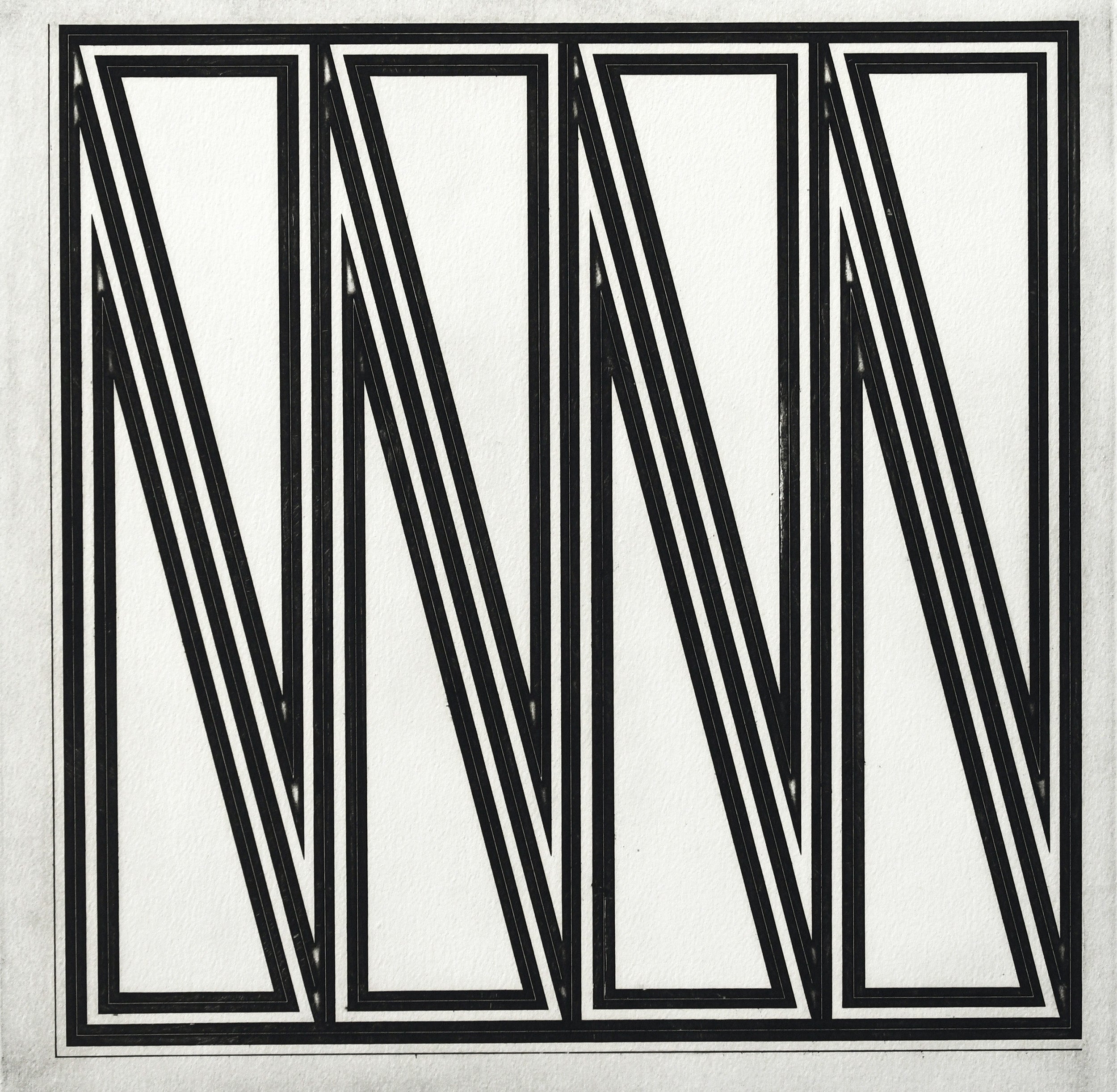
Eight Red Arcs, 1964, screenprint
Then primarily a painter, House’s time in industry opened him to the possibilities of the art print. Like his contemporary Joe Tilson, he was fascinated by the orderliness of its machinery and the arcane technical language that accompanied it, which soon migrated to the subject and titles of prints: Multi-case, Vertical Screen, Quoined Chase, Mitred Matrix. In 1961, as his typographic design was beginning to reshape the face of public and private art presentation, he approached the silkscreen technician Chris Prater, with whom he had recently collaborated on a job printing posters. Like House, Prater had recently gone solo, but it was at House’s suggestion that he might set up a print studio – the now famous Kelpra Prints – and edition some screenprints for him.

Series Tri, 1976/77, woodcuts
Together they produced ‘Blue’, the earliest pure art screenprint made in the country: a square composition, utilising the overprinting of two separate mesh stencils to achieve a colour balance owing something to the work of Josef Albers. ‘At this time,’ House later wrote, ‘after academic painting studies my ideas were formed in the direction of producing works devoid of acquired marks, complexity of motif or space illusion.’ Here is the restraint of a designer’s touch, and an example of art manifesting Marshal McLuhan’s famous motto that ‘the medium is the message’; a screenprint about the silkscreen process, a revelatory moment captured in ink on paper. And yet, of course, with House’s idiosyncratic sense of colour, it has a strange, personal radiation – and, despite what he says, an illusion of far-projecting, infinite, poetic space that revealed he never truly left his ‘Neo-Romantic’ roots behind.

House’s studio designed by MJ Long, joint architect of the British Library, National Maritime Museum in Falmouth, Pallant House’s new wing extension, and numerous artist studios, including Frank Auerbach, R.B. Kitaj, and Peter Blake
The simple but alluring success of Blue prompted a series, and the introduction of House’s friends Richard Hamilton and Eduardo Paolozzi to Prater to produce further screenprint editions. Overnight, British printmaking changed: it had not only a new medium to work in, but an emerging collaborative field of independent presses and young technicians. ‘For me, the day of the artist struggling with his bare hands is finished,’ Paolozzi announced. ‘Nobody would expect an aerodynamicist to build his own wind tunnel.’
For all the swinging glitz of House’s London scene and the gravitas of his client base, it was precisely this behind-the-scenes nature that was the strength of his art and his design work, a foot each set firmly within the camps of creative and industry. A consummate workman (Christmas was, according to his children, his only day off), he was a professional delegator who understood the production chain, with a practical humility that kept him from art superstardom but on which his success as a designer hinged. He described how his circuitous route into graphics gave him a profound understanding of the relationship between imagination and mechanical boundaries:
‘On leaving art school, the majority of would-be graphic designers (a term founded in the ‘60s) entered group studios or agencies to re-establish as artist in studio work environ, usually creating presentation visuals, then by hand with photographic aids usually followed by printer’s mark-ups as specification for print production. Aesthetic artistic leanings and art school training in draughtsmanship etc. led to work of quality but often with little regard to the compositor or printer’s machine room problems...’
E Quoined Chase, 1970, etching
Gordon House’s forays into London as a student in the 1950s, followed by residency in the suburbs, encapsulated the limbo state of the post-war period in which he worked. Having trained at Luton School of Art and then St Albans (commuting on the bus from Letchworth Garden City next to Richard Smith), he spent time working under Theodore Kern, an ecclesiastical sculptor who had escaped Nazi Germany and now found himself restoring Stations of the Cross in Blitzkrieged churches – a very different environment to the ICI. Brief stints as a sign and banner-writer, hand lettering Gill Sans with a sable brush taught the value of lines, contours, intersections as modules of tone and directors of space: later series of ‘Tri’ prints, in etching and woodcut (a callback to his sculptural apprenticeship), explored how modular designs could effect completely different characters and values simply by changing colours, orientations, and surface textures.
London at the time of his arrival was in a painful process of rebirth; concrete replacing exploded brickwork, a debris-cleared space inviting new opportunities: ‘But he was aware,’ writes David Mellor, ‘of that ruinated, picturesque, no-man’s-land aspect of the post-war landscape and townscape where, for example, he met in Soho ragged National Service deserters who lived on in bomb sites as modern hermits’ and where ‘Dubuffet scoured the underside of the modern city to find the scratchings and markings of the marginal and deranged…’
House, working at and with margins, often out of public view, developed over time a similar magpie attitude: to memory, colour, shape, sound. Peter Blake recalled him scanning the markets of Islington for kitsch and Pop paraphernalia, which he would present on studio visits. In his printed work, produced privately, his art career often politely divided from his professional one, he accumulated a kind of wunderkammer of shapes, grids, and systems of visual organisation: a mid-century Grammar of Ornament, replacing the grandiosity of Owen Jones’ original with unseen and overlooked emblems of industry.

Pontardawe Tin Works (Benjamin Evans), 1984, etching & aquatint
As the name of Jones’ Grammar manual suggested, design was for him a language, and the power of House’s work at its best is his creative fluency. He had an imaginative capacity for combination that could unite the blurry, rough-edged, inconsistent world of memory with the rigidity of the grid. An interconnectedness of things and places instils his art, finds parallels in the criss-crossing lines and layers of print media – where memories of William Green’s action painting antics in 1957, skidding and slipping a bicycle through bitumen over a board (gleefully satirised by Tony Hancock in The Rebel, 1961) could suggest the veins of rivers, canals, wires, smoke and roofs, valley lines, the insistent connections of the two Garden Cities in which he grew up and worked – places where design and vision transformed on contact with reality, as people trod, littered and trespassed the paths put down in Ebenezer Howard’s ‘slumless, smokeless’ plans.
The crucible for this receptive memory was Pontardawe, Swansea Valley, where House was born in 1932 – mine and smelting country, where everybody walked, there being few cars and ‘buses and trains irregularly rare’, so that everyone knew the heft and ebb of the valley basin by the ache of their feet. The sensory archive of early childhood in the valleys would later become an important source of inspiration:
‘Inside the house, and in my bed at night, from below my front window the noises as rhythm grew glowing with the furnaces and power lights. The presses banged in unison with the roller mills’ groans interspersed with blue flashes from the riveted plated metal foundry floor. Thumps of malleable steel and the travelling white-hot metal strip boom up from the valley factories beneath their black corrugated roofing to a rumble return down again and around my bedroom walls to sound finally against the hill behind the house before once again crossing that cowering valley below. Forever orchestrated throughout my time.’
In 1984, House published the Welsh Portfolio, a series of ten etchings ‘which embraced personal memory interpretation in ways of routes outside that early restricted haven’. The suite drew attention to the world of his father, made destitute by the Depression, forced to find another life in Letchworth with his family and retrain as a painter-decorator; and of his grandfather, Bill Evans, old hand of the tin-plate industry, entombed in a tunnel of green within jewel-red valley hillside:
‘On leaving the valley of my origin there has always been that pull to return. To be brought up within such a valley, embraced on two sides by the walls of ragged hills, moulds the mind with such containment almost to the point of lost comfort and satisfaction. Visually the village is as was, totally enclosed, the way out hidden but known, although on leaving is restricted to the left or right, only to find yet other self-contained places. Once outside in the big cities the new world became absorbingly paramount but the memory lingers to remain. As everywhere in nostalgia a physical return proves impossible as all has vanished from childhood days. The valley is its other time and another place – what was experienced then was a period of differing needs when the black valley floor was, as most of South Wales, a manufacturing glow of metal, ingot into tinplate. Full time working peoples with their own production goals. This manual effort, with its richness of localised community, has long passed, happy as they seemed, no longer wanted and regarding the living standards of those working classes as no longer to be tolerated.’
He might have embraced the parallels between his work at the press with that of the rollers and metal plates of his father and grandfather’s industry, as Seamus Heaney did in Digging, the view of his father bent low to the ground, a spade in hand, finding ‘the curt cuts of an edge / Through living roots awaken in my head’, before excavating with his pen.

Mumbles (Dylan), 1984, etching & aquatint
House’s own excavation was the memoir Tin-pan Valley, published after his death in 2004. He joked about recalling episodes as if he were ‘generating copy’, an industry man to the end; and found that after years of exploring the quiet, abstract niche that was his own, and lending time and energy to the work of others, what remained reflected a life of living in-between: journeying, mediating, communicating, and returning in the end to the sense of place and person his early graphic work had seemed to escape:
‘At the given biblical age reached, a graphic designer and painter, embracing all as was and as is, is left with the debris of a life’s making, in my case, filled studios.’


 Small Copper")
 Small Copper")


")
")